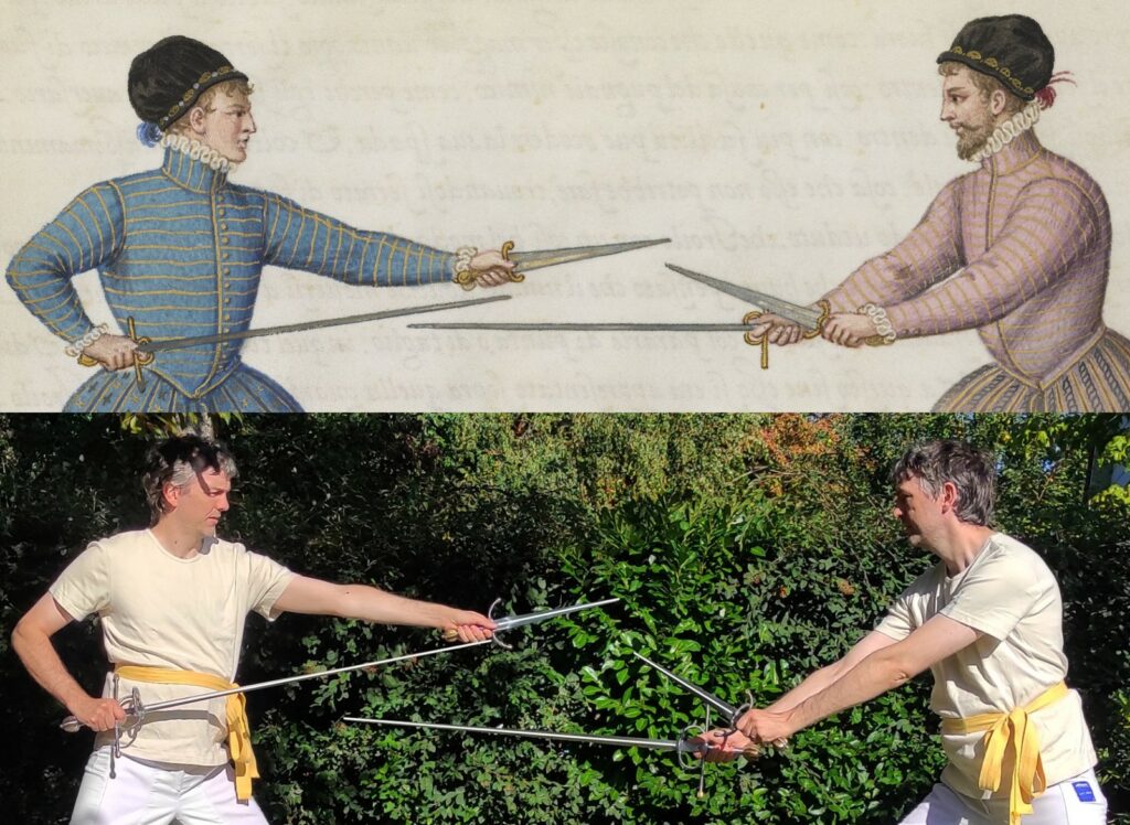
Please see the introduction of this series for general information about this project.
After gathering all the information, it was finally time to make choices and see it in steel!
Setting the goal
The overall goal was ‘a pair of sword and dagger inspired by Lovino’s manuscript’, which was quite a bit too general to work with.
The very simple illustrated hilts of the sword and dagger lend themselves poorly to HEMA training weapons, in my opinion (my personal choice in this matter is rather to have protective hilts with lighter gloves). On the other hand, it is a choice which can be made without trouble for sharp weapons. As detailed in the first part, the manuscript remains visually strongly associated to these simple hilts, and to complexify them too much would destroy the association, even though the functional incidence would be minimal, and the option fully justified historically.
I was therefore aiming for a matching pair of sharp sword and dagger. My use case, in a HEMA setting, might include solo form training and test cutting, thus the functional aspects were essential. I sought authenticity in proportions and design, of the hilts in particular, and also to a lesser degree in the materials (for example the hilt should be made out of steel). On the other hand, the historicity of the making process and assembly were not a priority. The fact that I could not pick any single original pair as the perfect candidates for Lovino’s sword and dagger made the project that much harder; mixing and matching is always difficult.
The swords in the manuscript are very consistent in size and overall looks with the group of type 39, relatively short swords that have been detailed in the previous part. It seemed natural to pick that typology.
The decorative elements calling back to the pommel seemed to be a must, consistent with the artworks and museum examples. On the other hand, I was not a fan of the hollowed-out decoration (and also anticipated this to be very work-intensive). Also, I figured that the kind of full damascening of the hilts that is seen on originals would be way out of my budget (if even possible). The guards of J126 seemed to be the best way to include enough details while keeping more or less plain steel, but ideally I also wanted some sort of golden accents to better match the manuscript. Some sort of fluting or grooves on the pommels seemed best considering the illustrations.
I was originally quite undecided about blade type, between the fullered hexagonal and the diamond cross-sections. Either seemed to match.
As far as dimensions were concerned, what I had in mind was:
- Sword:
- blade length: 98-100cm
- blade width: 2.5-3cm
- blade thickness: ~7mm at base
- ricasso width: 2.5cm (regardless of blade width)
- handle length: ~8.5cm
- Dagger:
- blade length: 25-30cm
- blade width at base: ~3.5cm
- handle length: ~8cm
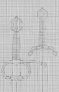
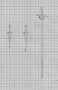
I made some sketches synthesizing how I viewed the weapons:
- My initial sketch for the hilts
- My initial sketch for the whole weapons. I did two blade lengths for dagger because I was not sure what was best
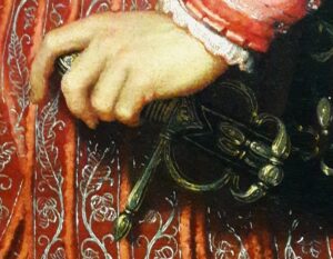
After a bit of looking around, it turned out that my best choice was the famous Marco Danelli, who fortunately accepted! Marco is pretty much the best rapier maker on the continent in my opinion, so this project could not land in better hands. He was certainly the person to sort out the mix of original elements I wanted to include.
Marco converged with me on some more design elements before starting out:
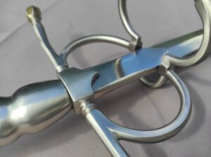
- The quillon block I picked of a standard squarish shape, with a small point
- The handle I finally decided to have of solid metal, as on many originals. Marco is, as far as I know, the only maker doing these on the regular, and I was quite curious about how they would feel
- For the blades I eventually decided for a diamond cross-section. Marco pointed out that this would let him balance the blade in a different way, with the mass distribution more focused around the hand, leading to a very agile blade. This seemed to be a good argument for Lovino’s fencing
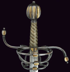
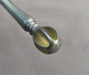
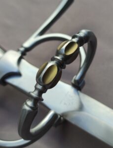
- For the pommels and callback elements, Marco proposed another sword as an inspiration (see below). This offered the simultaneous possibility to have lighter pommels (as on the hollowed-out examples), radial decoration as on the manuscript, and golden accents inside the grooves. An excellent solution!
Communication with Marco was smooth and the project unfolded quite quickly considering it was a fully custom design, over the span of a year. Smooth sailing as far as HEMA equipment goes! Nevertheless I have been quite anxious as completion drew nearer, as it has been the first well-researched and fully custom project I ever launched…
Without further discourse, let us see what Marco Danelli managed!
The sword
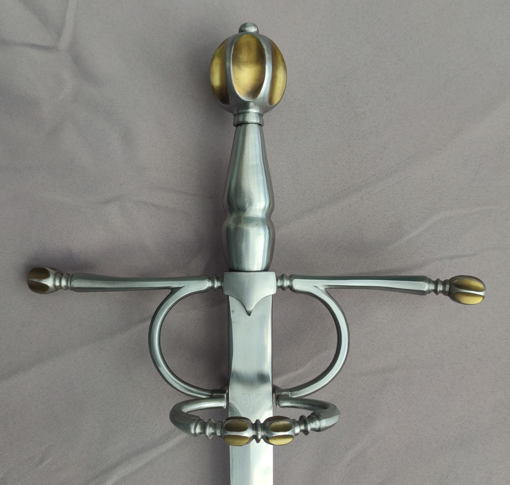
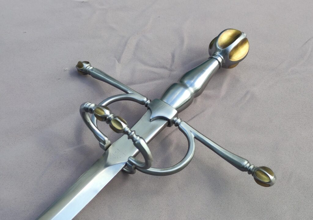
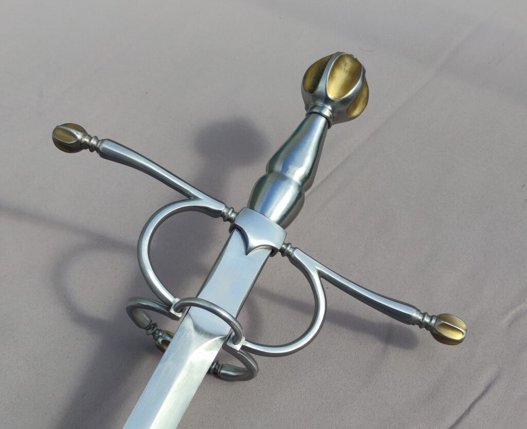
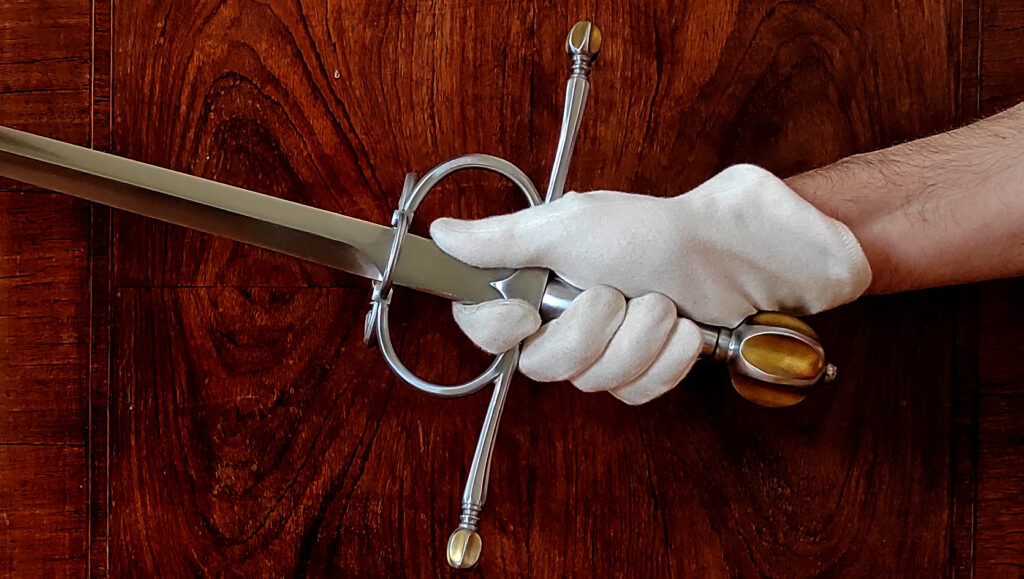
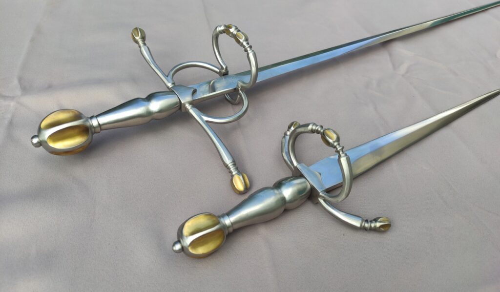
The sword turned out very well indeed! Fit and finish is stellar, hopefully the photos speak for themselves. All the important dimensions were respected. All the detailed decorative work really puts the sword that much closer to originals, which was my goal.
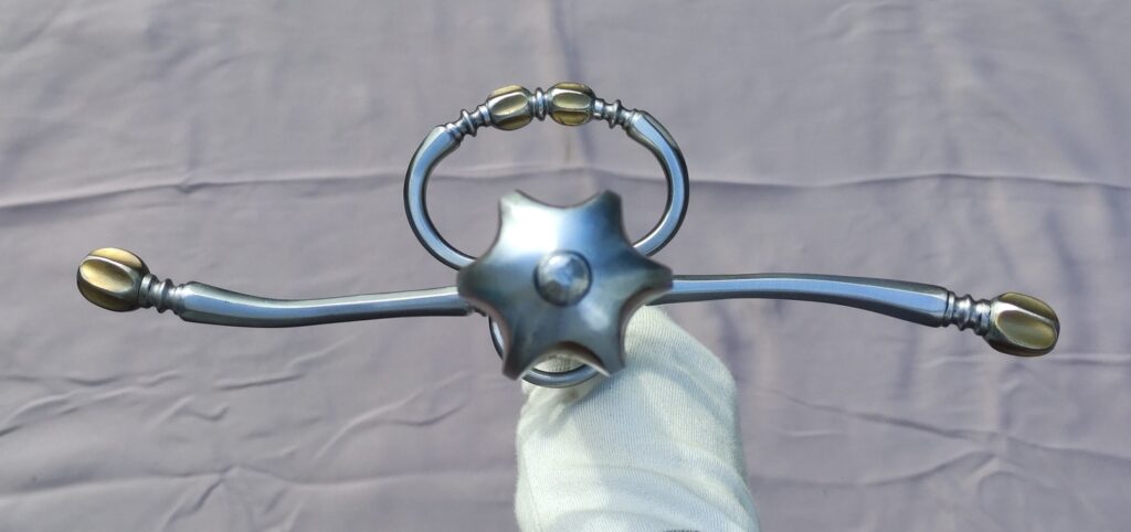
Marco went for the long and thin for the branches of the hilt compared to most originals, but for a very good reason. Lovino’s prescribed grip puts the thumb on the ricasso, and in order to do that comfortably and safely one needs some amount of room within the finger rings. This makes these rings grow bigger, which in turn imposes that the quillons grow longer to keep some harmony in the design.
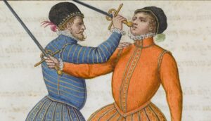
The pommel is a particularly fascinating part. Marco went for fewer but deeper grooves than I expected. At first glance, I was worried that it could be uncomfortable to hold, but it turned out to be not a problem at all. It also makes the pommel extremely light, possibly as light as the see-through hollowed-out pommels on some of the originals. Incidentally, it turns the pommel into a flanged mace which would be devastating in the pommel strike demonstrated on plate XXIX:
This pommel, together with the thick blade, gives a very particular balance to the sword, of a kind I had not experienced before. The blade tapers quite aggressively from the ricasso’s 25x7mm, and so the tip is very light too. The mass is focused around the center of gravity (here are all the stats). It has proven to be challenging for me to faithfully represent that feel with the current version of my tools; in many respects it turns out to be fairly similar to my Darkwood rapier but yet feels different. One of the best representation I have is a prototype, using a point mass at the pommel’s location and a tapered blade shape to build an equivalent mass distribution. Here is how these two swords compare:
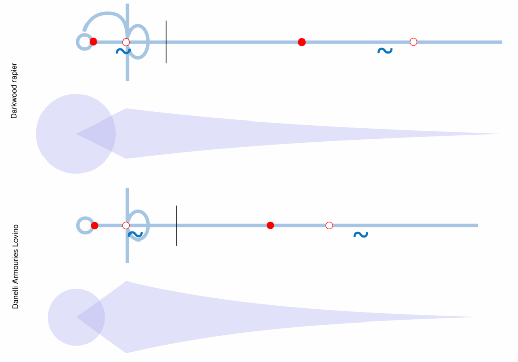
The Lovino ends up feeling much shorter than it actually is, especially compared to the Darkwood which only has 7cm more blade but feels a good 30cm longer when you are cutting around.
I am unfortunately unable to compare that mass distribution to the original swords, as I do not have that sort of data about them (yet?). At least some of these did seem to have very light pommels (see the hollowed-out examples). But it is certainly an interesting handling experience! You can see me moving it around in dall’Agocchie’s first form here.
The dagger
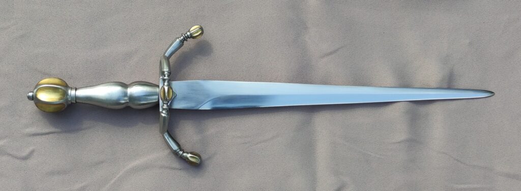
The dagger was actually the hardest part of this project, because of the discrepancy between the manuscript and the museum examples. Taken at face value, the manuscript has daggers around 40cm of blade length and 4cm wide or so, but I just did not find a blade that big in my research, especially not associated with a sword compatible with Lovino. Some museum examples look like Lovino’s daggers but are very much scaled down. Therefore my specs were not so precise. On matched weapons, there is also a need to maintain some sort of harmony in the set. As drawn by Lovino, I am not sure the pair would go together all that well. Marco took up the design to match the sword and ended up within specs, but had to make choices that I did not anticipate.
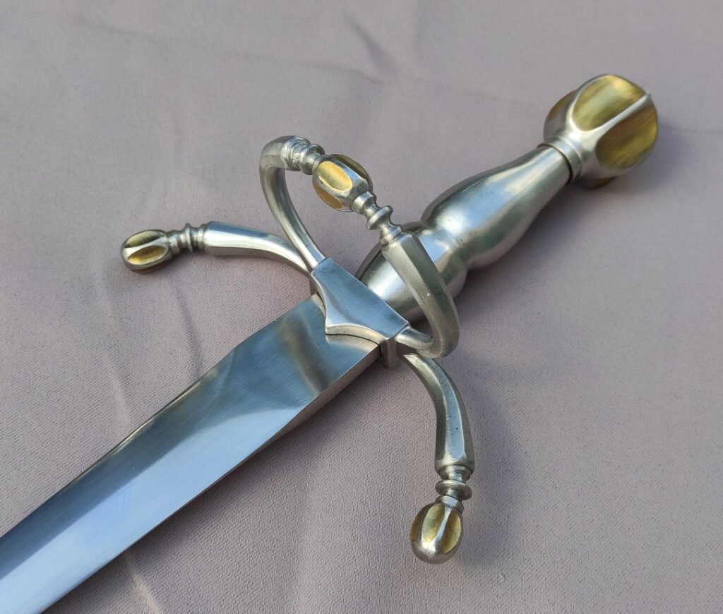
The root of the issue was the ring. The way he does them is as on sword hilts, that is, they sprout from the root of the quillons instead of being fixed upon the quillon block as is more common on daggers. Also, I had asked for a callback element on it, and because of this Marco had to make it relatively big. Now, with the ring being relatively big, he could not keep the quillons so short or the blade so wide. So he had to make the whole hilt a fair bit larger than I thought. But to keep the strong triangular profile of the blade (that is certainly one of Lovino’s visual characteristic), he kept the blade quite short, at around 26cm.
It certainly was a neat and compact parrying dagger that complimented the sword very well. However, having it in hand made me reconsider a lot of things. I was initially unaware of these compromises that had to be made, but even then I am not sure I would have made an informed choice without seeing the result first hand.
For starters, with the relatively large guard and short blade, the association with the manuscript was a bit lost. It turned out that the triangular blade was not sufficient, at least in my view.
The blade would have been great on the small hilts that many original have, but on this bigger hilt, it felt undersized somehow. The hilt was one of a dedicated fighting weapon which offers great coverage and a comfortable grip, while the blade was one of a daily wear item that you do not want to take up that much room. There was a discrepancy between these components. Moreover, the triangular profile sort of increased the visual shortness of the blade, and made that contrast starker.
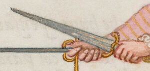
Besides, it made me look again through the manuscript and realize just how big the daggers are in there. I had not taken this into account so much in my initial specs, but this has practical consequences. In particular, you want a longer blade if you are to stab the opponent with your dagger as Lovino frequently shows, and also the longer blades give some cover to the hand when held side by side at the hilts.
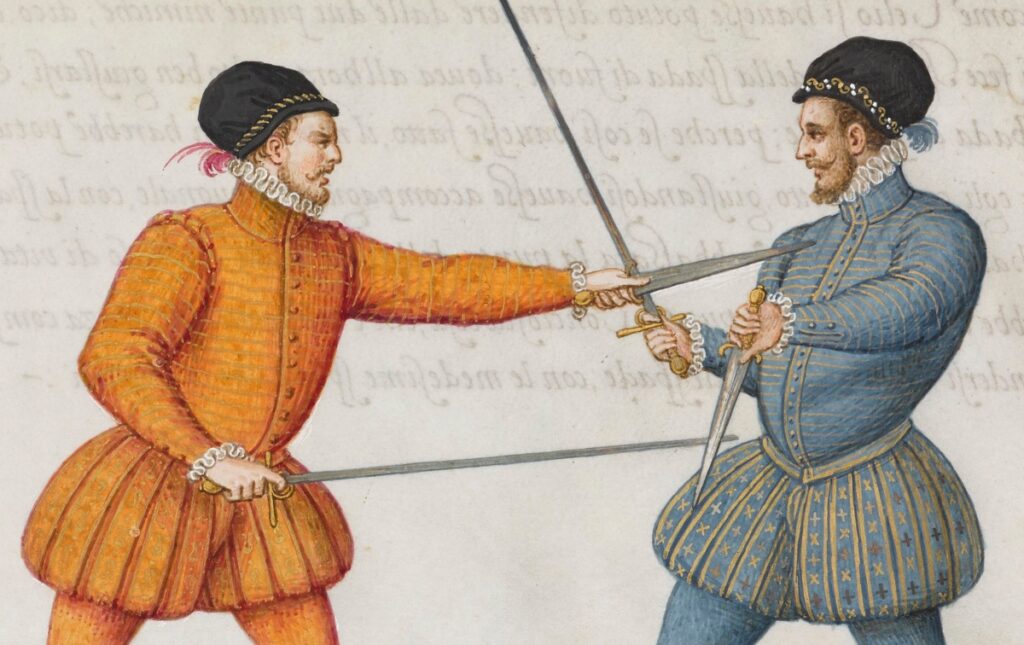
Therefore I decided to see if the dagger could be adjusted for a better match. It would have been a real shame to ditch all the work that already went into the dagger hilt. So I contacted Marco to see if making a longer blade would be possible, and he accepted! This shows a lot of dedication to customer satisfaction.
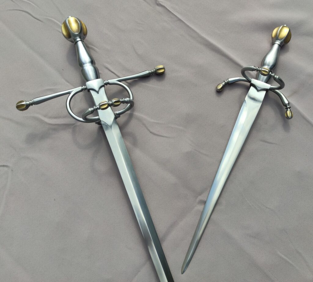
After a series of tests with cardboard blades on the hilt, and bearing in mind that I had to keep the original 30mm width to fit into the quillon block, I decided not to go to the full 40cm and keep to a 33.75cm blade (2.5x the hilt). This is only a little bit longer than the big p.0150.01 dagger, so I feel it is still historically plausible. It is a length I feel I could still wear at my back, while 40cm+ sticks out a lot. I expected the triangular shape to still be apparent despite the more acute angle, and the overall look to end up closer to the manuscript; a sort of hybrid between Lovino’s illustrations and the museum examples.
I was even more anxious to see the result. But at reception, I was immediately convinced this was the right choice. I think it turned out to be a very noticeable and positive change!
The dagger ended up much better proportioned on its own, and still perfectly harmonious with the sword. Here are all the measurements of the old and new daggers. The blade change did come with some drawbacks; the dagger is now a whooping 600g, more than half the weight of the sword! But most of it is in the ring and strong, the triangular taper means that it is absolutely not a wrist breaker. It would also give a lot of stability while parrying and beating the opponent’s sword, I would expect; of course these being sharps, I will only have limited opportunity to truly test this out.
Concluding thoughts
I am extremely glad to have undertaken this project. Exploring the swords and daggers of this period has been enlightening; for instance I was totally unaware that such simple hilts, paired with blades of this dimension, were common enough to form a category of their own. I now have a much better understanding of Lovino’s context just through this study. Seeing it in steel takes it to another level. It is a funny feeling to still be surprised by how things turn out even after mulling over this for so long. I am now happy to own what is, to my knowledge, the best approximation of Lovino’s sword and dagger that currently exist!
There are certainly things I would change or be more specific about if I were to redo this project. There always are!
The only modification in the structure of the sword might be the inner guard. On many of these hilts, the ring is inclined towards the tip, giving it a much flatter profile. This is of no practical consequence for me, as I do not intend to wear this sword, but it is something that I could like to try. Marco brought up several examples of swords with the same ring as mine here which I was not aware of originally, so it is not an historical issue but rather curiosity from my part.
Overall I believe both hilts are slightly upscaled compared to originals. This makes room for grips of course, but I do wonder how it would look and feel with tighter hilts. Practical considerations do enter in this; keeping that level of detail of the decorations on smaller hilts becomes difficult, and I believe Marco Danelli was already close to the limit of what he could manage. I would certainly have less space for my thumb. I wonder how much of a problem it would actually be.
I think the dagger would end up even better with a smaller, tighter hilt, a smaller ring or none at all, shorter quillons, all the while keeping the longer blade. That is something I would love to see; it would have been too much to ask of Marco on this order because it would have meant to redo most or even all components (I already felt bad for having him redo the blade!). I would also like to see how a thinner blade would play out; here I had specified 7mm thickness just like the sword by default, but seeing the difference in weight between the result and the originals, I now wonder if 5mm would not have been plenty enough given the width of the blade, while shaving off a lot of mass. I would expect all these changes to bring the weight down and possibly the point of balance forward, which might give interesting dynamics to the weapon.
The full steel grips were an experiment for me, as they are present on a lot of originals and I had never handled things like that. They are not as slippery as I initially feared, but having played with them enough now, I think I still prefer the friction of wire wraps. These also happen to be the sort of handle most represented in art. Overall, if I had to do this again, I would go for wire wrapping as the superior functional type of handle.
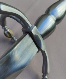
Still on an ergonomics note, Marco has rounded off the ricasso’s angle, which makes it more comfortable, but also a bit slippery under my thumb. He has a wider thumb than me, so to him it was not a problem. After testing this I would prefer a smaller rounding radius.
Looks are pretty great as they are. I would have loved to have a stronger contrast between hilt and blade. Marco proposed blackening, but combining it with his method for the golden elements was not easy and would have raised the costs significantly. I also feared that the deep black he obtains would make the whole thing too dark overall and remove the reflections on the faceted bars. However, I think blueing would work well. I would love to see variants like that.
There is a strong profile taper in the sword’s blade, and I am not 100% certain most originals were like that. It is completely plausible, but I wonder what would happen with less profile taper (and maybe more thickness taper to compensate?). As it stands, the blade is not the best at cutting because it is quite narrow at the impact point. On the other hand, it is very agile and fairly stiff. I would really need more data on more originals to make up my mind more precisely.
And this marks the end of my Lovino Project. It has been a fun and satisfying exploration of the treatise and its context. I can only hope the information I have gathered, especially in the previous parts, will be useful to other people to form their own interpretation of Lovino’s weapon.
Who knows? Maybe I will eventually dive into another one myself!
